
Landing page do cartão de crédito da Meutudo

Contexto
A Meutudo é uma fintech brasileira que oferece acesso digital a crédito, com foco principal em crédito consignado, antecipação do FGTS e serviços financeiros para trabalhadores e aposentados. + 19 milhões de clientes em todo o país +R$ 20 bilhões em empréstimos originados
Após ingressar no time de produto INSS da Meutudo em 2024, fui designado para liderar o design do Cartão de Crédito Consignado, um novo produto voltado para aposentados e pensionistas. O cartão oferecia diversos benefícios, incluindo saque do limite de crédito, cashback, seguro de vida, descontos em farmácias e taxas de juros significativamente menores do que as de cartões de crédito tradicionais.
A iniciativa fazia parte da estratégia da Meutudo de expandir seu portfólio de produtos, alcançar novos segmentos de clientes e fortalecer sua competitividade no mercado de serviços financeiros.
Meu papel
Design lead — responsável por conduzir todas as atividades de design. Colaborei com a squad Cartões INSS, um grupo multidisciplinar composto por 7 integrantes das áreas de negócios e engenharia.
Juntamente com o time de research fui um dos responsáveis por desenvolver a pesquisa, pensando em roteiro, tarefas a serem realizadas, criação do protótipo navegável e posteriormente coleta dos dados e apresentação dos resultados.
O problema
Uma pesquisa quantitativa revelou que uma parcela significativa dos clientes abandonava a jornada de cadastro do Cartão de Crédito Consignado, principalmente por não entender como o produto funcionava, o que deixava os usuários inseguros para prosseguir.
O desafio era claro: redesenhar a landing page para comunicar o produto de forma mais eficaz e reduzir o atrito cognitivo ao longo da jornada.
Com base nas hipóteses identificadas, criei duas variações adicionais da landing page para explorar diferentes abordagens de design e possíveis benefícios.

Abas
Hipótese de design
Organizar o conteúdo em seções nomeadas, vantagens, como usar, taxas, permitiria que os usuários navegassem diretamente para o que mais interessava, reduzindo a sobrecarga cognitiva ao revelar uma categoria por vez.
Prós
- Padrão familiar, amplamente utilizado em aplicativos financeiros
- Permite que o usuário se autodirecione e pule conteúdos irrelevantes
- Mantém a tela limpa e menos sobrecarregada
- Atende usuários com dúvidas específicas (ex.: taxas)

Carrossel
Hipótese de design
Um carrossel horizontal de cards apresentaria cada benefício como uma unidade independente e escaneável, incentivando a exploração progressiva sem exigir que o usuário navegue por abas ou role uma lista longa.
Prós
- Cada card foca em um único benefício, reduzindo distrações
- O gesto de deslizar é intuitivo para usuários mobile
- A hierarquia visual destaca os principais diferenciais
- Encoraja a exploração sem esconder informações por trás de interações

Lista
Hipótese de design
Uma lista vertical simples de benefícios, a versão já em produção, serviria como linha de base. A hipótese era que exibir todos os benefícios de uma vez, sem interação, poderia ser o formato mais claro para um público mais velho.
Prós
- Nenhuma interação necessária; tudo visível com a rolagem
- Funciona bem para usuários que preferem ler de cima para baixo
- Padrão já comprovado, em uso em produção
- Mais fácil de escanear todos os benefícios de uma só vez
Como o teste foi conduzido
Em colaboração com o time de pesquisa, optei por um teste comparativo quantitativo não moderado via Maze, garantindo respostas naturais e sem viés de clientes reais.
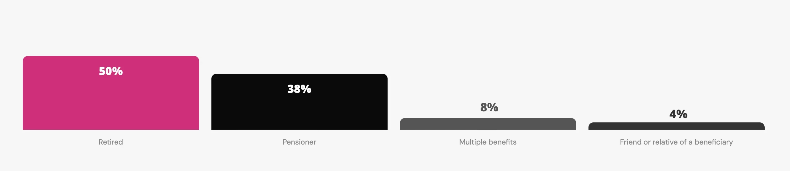
Quem participou do teste?
O público reflete o grupo-alvo real do produto: beneficiários do INSS brasileiros, em sua maioria aposentados e pensionistas.
Abas vs. Carrossel vs. Lista
Cada participante visualizou as três versões em ordem aleatória, navegando livremente por elas antes de avaliá-las em uma escala de 1 a 5.
Variante X
Variante Y
Variante Z - Versão atual
Principais descobertas
A versão escolhida pelos clientes
Com base nas pontuações quantitativas e nos feedbacks qualitativos, o Carrossel (Variante Y) foi o design mais eficaz. Liderou em todos os quesitos: compreensão, usabilidade, intenção de compra e qualidade percebida das informações.

Plano de continuidade
Com a fase de validação concluída, o time avançou para a implementação das melhorias identificadas em toda a jornada de cadastro, acompanhando métricas-chave para avaliar o impacto no comportamento dos usuários e na conversão.


